Methods and Tools
• Remote phone interviews
• Multi-language survey (Survey Monkey)
• Industry best practices review (Nielsen Norman)
• Card Sorting (Optimal Workshop)
MY ROLE:
I acted as the lead researcher on a UX project for a global Fortune 500 news and resource focused intranet for 50k+ employees. I collaborated with the content team to create interview and survey scripts around user needs. I then ran interview sessions and global surveys, completed card sorting activities, and reviewed best practices for intranet features. I also defined the IA and foundational user experience in close collaboration with the content strategy and development team.
THE PROBLEM:
The company’s current intranet no longer met the needs of the end users. While the company itself had associates who worked all over the world and spoke various languages, the intranet had a poor search experience, a homepage only in English, a bloated navigation structure, and wasn’t accessible for employees who only used their cell phone for resource and news access.
The goal of this project was to gain as much insight as possible into the ideal user experience and then apply that knowledge to a new user experience. The multi-method approach helped fill in gaps when knowledge around the UI was foggy and helped our product team prioritize features based on need.
MY PROCESS:
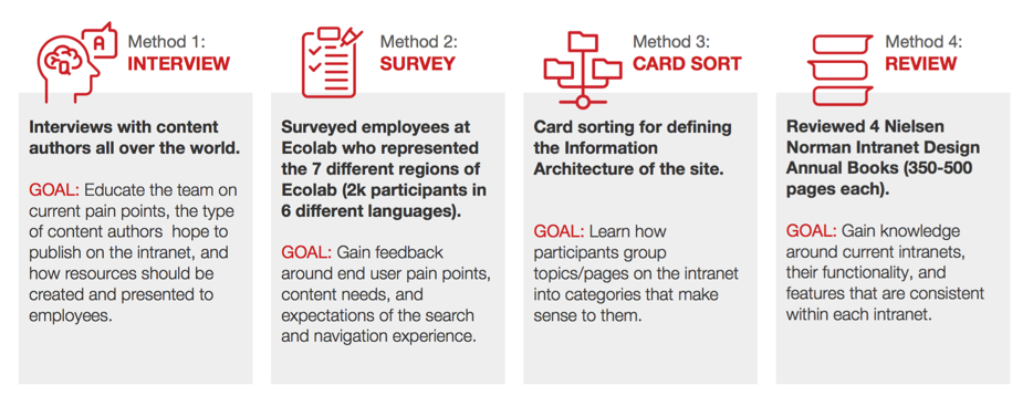
STEP 1: REMOTE PHONE INTERVIEWS
The first step of the project was to gather feedback from employees who were end users and content authors of the intranet. The conversations with these participants who represented various locations and departments helped uncover key insights that fed directly into the user experience.
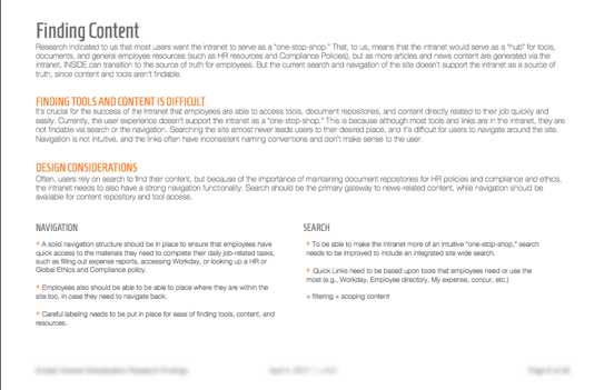
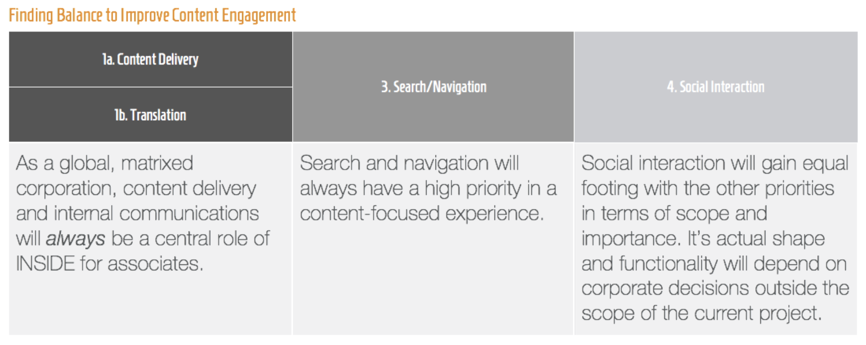
As the interviews were completed, insights were starting to be uncovered around specific content needs for users. The company had a matrix organization structure, meaning that users would need news, leadership blogs, organizational updates, and resources for their language, their job function, and from specific departments (HR, IT, travel) based on their location. This means that there could be no one-sized-fits-all user experience. A page like the homepage needed to pull in multiple department and location’s news and resources for every employee’s work situation. We also learned the importance of resource pages like HR documents or travel and expense. Users needed a way to filter down and search within the resources built out by departments like IT or HR.
The output of this method led to a “source of truth” document that I presented after every method was complete. It included insights uncovered, as well as key features identified as important for the success of the intranet.
STEP 2: MULTI-LANGUAGE SURVEY
There are thousands of employees who use and rely on the intranet to give them company related news and resources. Getting a consensus from employees from a quantitative standpoint helped flesh out a lot of the features uncovered with the interviews. It also helped identify end user pain points, the type of content they care about the most, navigation and search expectations, and translation needs.
We needed to gain feedback from a percentage of the company that represented different parts of the “matrix.” I worked with the global communications team to write the survey script, design it within a tool, and have those questions translated into 6 languages in addition to English. After we received enough responses, we had the data coded together to all appear in one dashboard so that the insights could be segmented and identified based on job role, job location, language, and job title. This helped us better understand the homepage needs around utilizing someone’s location, job type, and experience level to feed them specific content on their homepage. And it also helped us rank specific content on pages and helped place and style other types of content and tools.
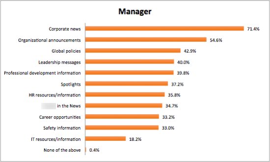
We wanted to uncover the types of content different employees care about the most. This is the perspective of a manager. 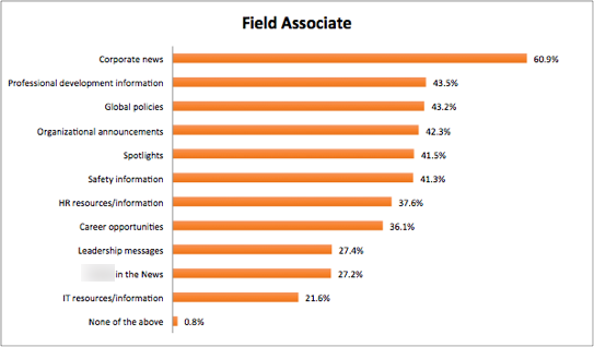
We wanted to uncover the types of content different employees care about the most. This is the perspective of a field associate. 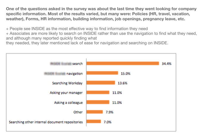
One question covered where associates go to for the “source of truth” for information and resources for their job. 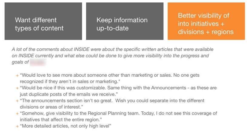
Open ended responses were key to be able to uncover high-level needs of users, such as up-to-date content or a variation of content. 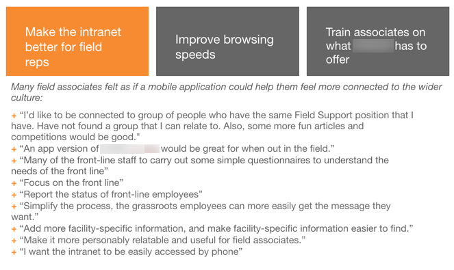
This is another example of the valuable open ended responses. This covered importance of quick browsing speeds, a good search, and have a good mobile experience.
STEP 3: INDUSTRY BEST PRACTICES REVIEW
As apart of the research review, I read 5 different Neilson Norman reviews that spoke to usability best practices and outstanding Intranets that displayed and segmented content in a compelling and usable way. Neilson Norman is an industry expert in UI and UX best practices, so following their cues into what works best was a great way to frame the UX around the needs of the user that align to industry best practices.
My goal was to understand common UI trends and elements that exist within every Intranet, features that are crucial to the success of the Intranet, and how tools and resources should be displayed for easy access. We learned early on that aspects of an Intranet included: a productivity toolbar within the utility navigation, a “task-based” navigation that was labeled so users could take action, and a faceted search within each department “hub” so users could filter down and search for information based on where they are within the site.
STEP 4: CARD SORTING
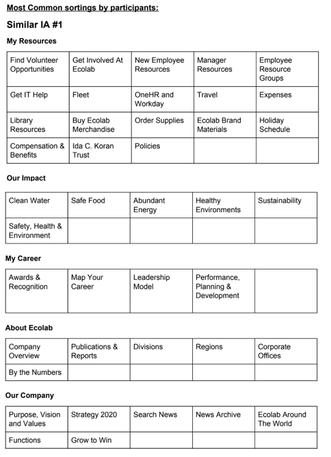
The final input of the source of truth document was insight into the IA and navigation needs of the user. The core team struggled with how to label and sort navigation items without input from the end-user. Because of this, we decided to create and input different navigation labels into Optimal Workshop and task 70-80 users to complete an open card sort. We decided on an open card sort to validate whether our assumption that a “task-based navigation” should exist. When the final results came through, we were given common structures and labels that users grouped together and named. This validated the idea that users needed navigation items labeled based on a task they wanted to complete. For example, we decided to name their “resource” area My Career, which provided items that shaped their development as an employee.
After all of the inputs were collected, the source of truth lived within the team’s toolbox to use as a resource for design and content strategy. The findings were presented to a large group of stakeholders, content authors, and our internal design and development team to gain consensus on features, the personas that were developed out of this effort, and the ideal state of the intranet based on functionality needs.
STEP 5: RAPID PROTOTYPING AND IA
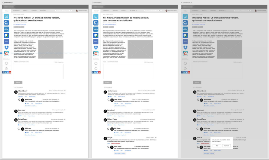
I also contributed to creating the early wireframes and sitemap of the website. Utilizing empathy and feeding the findings directly into the UI was easy, but gaining stakeholder consensus was tricky. Our stakeholders had a hard time understanding early UX and its importance for establishing the baseline UI experience based on the research. Also, our development team members wanted to be able to sign off on the designs and understand the level of effort early. Because of this, I started doing “live prototyping” design studios with the client, where I would pull together our design, content, and development team to brainstorm page design on the website. This pushed me to prepare “best practice” designs beforehand, and think on my toes to redesign the UI live in front of a small team to gain consensus from various perspectives of the team. I utilized Adobe XD to live wireframe in front of the client and created short videos that showcased the functionality so the company could understand what the UX could look like. As a researcher, it was important to teach empathy and thinking from a new perspective to the client, as well as our development team. Being able to solve a problem or workflow together based on the source of truth document was key into having a user-focused team and compelling UX.
After the wireframes were complete, I worked closely with our UI designer to translate the low-fidelity wireframes into a functional, but beautiful UI. I stayed on as a consultant to feed the user perspective throughout the project. This was key to maintaining a great UX and thinking from the user’s perspective.
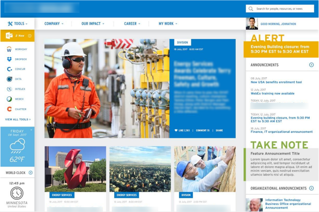
The final design created off the low-fidelity wireframes I created. The research findings and IA strategy fed directly into these pages.
OUTCOME:
Since its launch in October 2018, the project has won internal awards for innovation and has been well-received by the end-users. Enhancements have been made since the initial launch, which allow for subscriptions and a better mobile experience.
Since then, I have also worked with similar teams on their e-commerce research and UX design to develop user focused shopping experiences. The importance of research and advocating for the user is something that reigns true in all types of platforms and experiences, and being able to see it through and teach others the importance of it, makes all of the sweat and tears worthwhile.