
Evangelizing UX across multiple teams can be tricky and frustrating, but it’s all worth it when your client and team becomes more empathetic to the user.
Methods and Tools Used:
• Interviewing
• Card Sorting (Optimal Workshop)
• Usability Testing (FUTURE)
MY ROLE:
From 2018-2019 I worked with a window manufacturing company as a research consultant to better understand their digital tools through the perspective of their customers.
For this project, I lead the exploratory research and usability evaluation for their main website redesign, which currently had lower engagement rates and poor SEO practices. The goal of the website redesign was to create an easy-to-use, compelling, and inspirational website that better served the core user needs. I worked closely with the development team, the content team, and the design team to make user-focused decisions throughout the project lifecycle. I also developed the navigation on the website, the sitemap, and taxonomy structure.
THE PROBLEM:
While the client had a gorgeous website with compelling stories and stunning imagery, none of it was findable, content overlapped, and the message to the user was unclear. Finding a product or educating oneself on window terminology would lead users down rabbit holes and quickly frustrate them.
Working with the client to work through design thinking activities, such as empathy mapping, taught us a lot about how they see the user. The exercise revealed that while they are passionate about a good experience, they didn’t know how to take the data and segment it in a way that helped create pages and stories on their site for their main three user types. Our problem to solve was to work with the core users to learn about their needs, pain points, channels and methods for research when buying windows, and their needs from a manufacturing website.
We identified the potentional users and worked through a plan of action, and then got to work.
MY PROCESS:
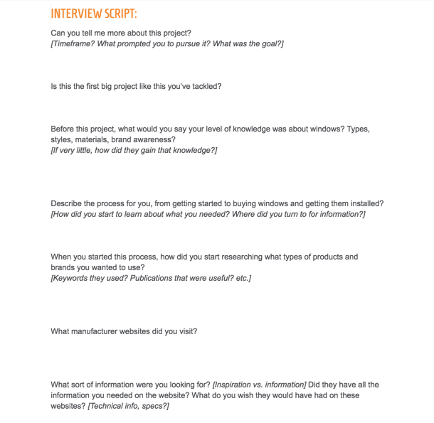
STEP 1: INTERVIEWS
The client and I chose two qualitative methods to work with to help define the ideal user experience for the new website. The first method was 10-12 interviews with each user “type” (e.g., homeowner, architect, contractor) to fully represent their needs, behaviors, and workflows when needing information from a manufacturer website.
After the empathy mapping exercise, my team and I went and created hypothetical personas/user segments to represent our “working theory”. I also wrote three different types of interview scripts for the 10-12 interview sessions. I was also in charge of creating and collaborating with the recruiter on which criteria should exist to screen candidates correctly. This website had specific user types, so getting the right audience was key for useful feedback for the client.
Stakeholders were given highlight recordings to listen to. Having the main stakeholders looped in and listening to feedback is key to gaining empathy across a team. I also had our content strategist and lead designer sit in on interviews to hear the feedback first-hand. This created a better relationship and empathetic mindsets from the get-go.
After the interviews were complete, I collected all the insights and completed an affinity diagramming exercise, where insights labeled and categorized the findings to help inform the story that would be told via the findings and recommendation document.
STEP 2: CARD SORT AND IA DEVELOPMENT
The next method’s goal, after the findings were collected from the interviews, was to understand how users group information on the manufacturer website. Our task was to develop a “hypothetical IA” to translate into a closed cart sort. We chose to go with a closed card sort because we had categories found from the interviews and current web analytics and decided to frame the card sort as a “working assumption test” rather than a brand new exploration of new categories. We also let the user create their own categories if they were not satisfied with their own.
Participants were asked to sort items into pre-named categories so we could better understand which navigation items should go where, and how the sitemap should be designed based on how users group these items. Below is the participant perspective of the card sort.
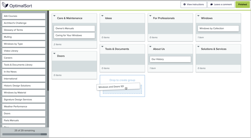
The card sort helped validate findings within the interviews to create a user focused information architecture. The data informed how content should be grouped within a page, how the navigation should be grouped and labeled, and what kind of taxonomy needs to exist for smart filters and groupings on document pages and inspiration galleries.
We presented the findings and recommendations for the website in conjunction with the content strategy for each main “template” that would exist on the site. This effort was in collaboration with our core team of content strategy, design, and development.
INSIGHTS FOUND
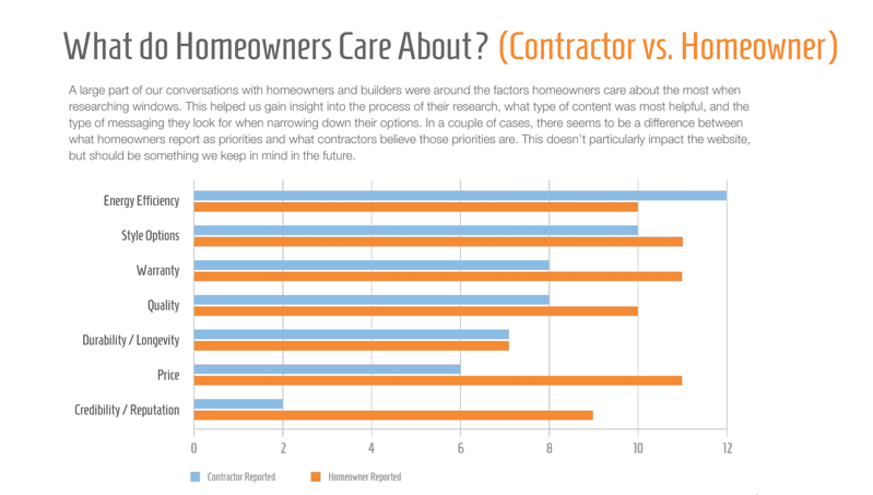
The findings honed in on the types of things that users care about, whether it’s window quality, warranty, the look of the window, or how it functions. We learned about specific goals users have on the site, how they might overlap with each other, and how that impacts how they flow through the site. Based on the card sort findings, we used this to confirm our theory of how users see the site structured, no matter the persona type.
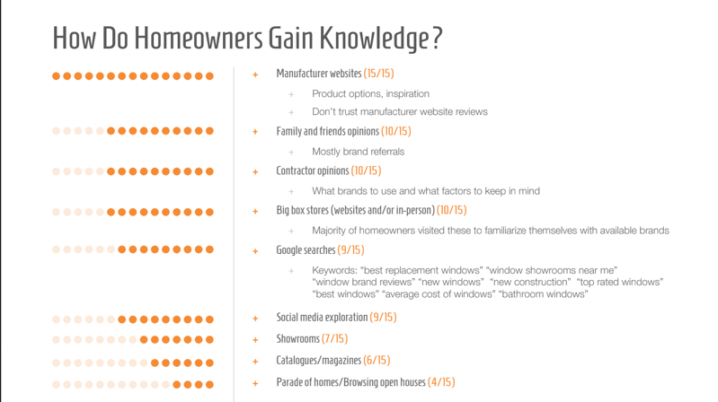
We also discovered when a manufacturing site comes into play during the buying process, how much a user relies on it for information, and what they like least and the most about their buying experience. This helped us create key pages and understand the value of inspirational areas on the site, as well as educational. Pages like “Inspiration Gallery” and “Windows 101” were newly created webpages that came out of the interview data around the importance of the intersection of education and inspiration.
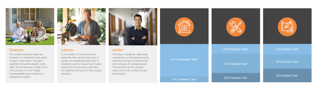
One major issue with the way the client thought about their users was that they were over-segmenting content and creating duplicate content for different types of “roles” (i.e., homeowner, architect, and contractor). The types of content and goals they had in mind tended to overlap based on their “intent” (i.e., wade, swim, and dive). Based on the interview findings, our team collaborated on new personas for the site, that re-thought the way that our client should thing about their users on a site so content is easier to find, labels make more sense, and goals are being met. While different “roles” people take on impact the level of knowledge they have around windows, the actual areas on the site and type of content they desire overlap. A b2c website is unique in that roles can be a starting place, but the shopping experience isn’t as clear cut as an e-commerce site. Content should not be silo’ed based on role on the website, because then crucial information will be hard to find. Instead the client should think about sectioning off the site by: education, inspiration, purchasing, and accessing technical information.
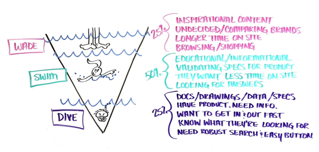
Below is an example flow of the reporting document. We tried to utilize visual cues to communicate to the client how they should picture their personas and their goals flowing through the site. In this example, we encouraged our stakeholders to imagine different “levels” of use, where the more shallow a user, the longer they stay on the website, but the less they want to “dive” in for technical information. We also heavily encouraged our client to think about education and inspiration on the website, since homeowners are key audiences, but don’t usually know much technical information. We wanted to also encourage the site to be designed so that the more technically focused users can “skip” (or dive) and find the information they need quickly.
The findings were combined into a “findings and recommendation” document, where we recommended user-focused design approaches as well as a content strategy and information architecture structure. After our clients understood the user perspective, we continued through the redesign process. I sat in design studios and feedback sessions to make sure user perspectives were kept in mind throughout the entire project lifecycle.
I am currently coaching our internal and client team on best practices for iterating on these pages based on usability testing, web analytics, and Foresee feedback. Listening to the user within every stage is key to keeping the website fresh and usable and I am proud to fill that role within multiple projects and clients.